Follow Us
Subscribe to our
Newsletter

The Relativity of Colour
Oct 02, 2018
Take it in context
Now that you better understand colour theory
and colour harmony, it’s time to explore how colour can enhance your designs.
Not does colour on its own have impact, but colour also affects everything around it. This is known as the relativity
of colour, and it’s a complex area of colour theory.
Consider how the background colour affects this red square.

Provided that your display has enough colour stability and gamma correction, you should notice that the violet line to the left of this image appears to have a bit of a red-violet quality, whereas the line on the right has a blue-violet tinge.


Consider these poster templates. The grey version is dull and lifeless. It lacks any sort of “punch”—apple or otherwise.

Choosing colours
Now look at the third poster. Notice that the paper colour and text colour remain unchanged from the predominantly red-orange version.
This third design picks up the green in the leaves, and the apples seem to jump off the page. (To understand better why this is, read our companion article about colour harmony, paying particular attention to the section on complementary colours.)
Choosing colours for your design can seem overwhelming. Approach it logically, and ask yourself some key questions:
- Are you working on a seasonal project?
If so, perhaps an analogous colour scheme (e.g., yellow, yellow-green and green for spring; red, red-orange and orange for fall) might work best.
- Does your project include a photo or illustration?
If so, pick a colour from this image, and select a range of other colours based on this choice. If you’re going for a sedate look, choose analogous colours. Conversely, if you’re looking for something vibrant, consider complementary colours. Still need help? With Canva, you can upload an image and get suggestions.
- Does your company have an established visual identity that includes a brand palette?
Colour is an important consideration in every company’s identity system. For example, the Government of Alberta’s colour palette is bold and dynamic, drawing inspiration from the richness and diversity of Alberta’s landscape: stone, dusk, sunset, prairie, pasture and sky. Consistent use of the core colours defines and reinforces the provincial government’s distinctive character. These colours are used in all communications and promotional materials. Tints and shades of the primary palette allow for flexibility and variety in design. (Based on the Government of Alberta’s Visual Identity Manual, Edition 22, September 2018.)
- Is this a recurring project?
If so, consider making a colour palette, and refer to this consistently. Your templates may remain the same, but you have the freedom and flexibility to use a different colour. This is particularly useful if you need a colour-coding system to distinguish pieces intended for different purposes or different audiences.
Tools and apps for choosing colour
Now that you’ve read our series of blog posts on colour and colour theory, we hope that you have a better understanding of how to choose colour for your projects. Greater understanding doesn’t imply that you’ll always get it right; however, as with most things, there’s an app—or several, in fact—for that.
There are a number of websites, including Canva, ColourLovers
and Paletton
that suggest various colour palettes. Upload a photo or image to Canva to instantly generate a colour palette to use in your designs. Similarly, ColourLovers lets you browse several popular colour schemes, which you can then use with your projects. With Paletton, you can experiment with monochromatic, analogous, triadic and tetradic colour schemes. You can even preview examples of different applications, colour-blind simulations and gamma simulations.
If you already have a colour swatch and aren’t sure which colours to combine with it, look to Color Grab
(Android only) and Swatches
(iPhone only). With these apps, you can also start a design based on any colour: point your smartphone camera to the colour you want to capture, then tap the screen to instantly pick the colour. You can even calculate the colour palette used in photos. The best part? These apps help you find the best colour combinations based on colour theory.
Now that you understand how colours work together to evoke emotions and reactions, you’re better able to make sound branding decisions and colour choices. Use your newfound knowledge to make your brand stand apart, appeal to your target demographic and, hopefully, achieve positive results.

Window tinting for vehicles offers several benefits, both practical and aesthetic. Read our blog for more information
Take the next step to grow your business
This year of 2020 is proving to be a year of an unknown type. Protecting our health and those of the ones we love is a great responsibility so social distancing is worth it. There is also the snow. When will it end here in Edmonton area? At a time of social distancing for healthy and safety, what can we do when a weekend like Easter is near? Well, it might be time to get creative and learn more about technology at our fingertips to be sure connection happens regularly. Here are some ideas to get you started if you are a bit rusty like me. Knock Knock jokes Knock Knock jokes are a video opportunity waiting to happen. I recently rediscovered these corny sources of humor while searching the Internet. Inspired, I video recorded myself saying “knock, knock,” and sent to my almost five-year-old great nephew via his Mom’s smartphone. In a little while, he responded with “Who’s there?” in his own video. From there, we traded short videos until hitting the punch line. It was a much-needed connection in the middle of a day for me. My great nephew and his parents, who are working from home and entertaining their two young active boys, appreciated the diversion, too.

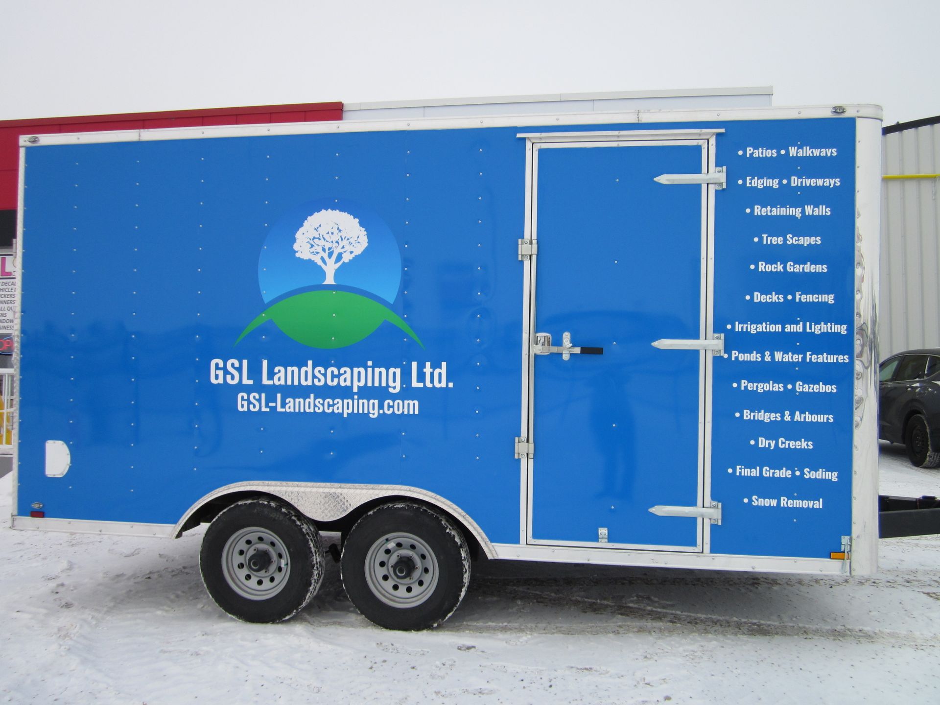
Locally owned and operated,
JLS Decals & Signs serves the communities and surrounding areas of Morinville, St. Albert and Edmonton, Alberta.