Follow Us
Subscribe to our
Newsletter

Colour Harmony
Sep 25, 2018
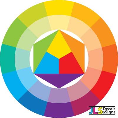
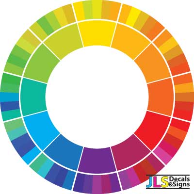
Remember the colour wheel from our colour theory primer? Note not only the position of each of the 12 pure hues within this circular diagram, but also their relationships to the colours adjacent to, and across from, them. Understanding these colour relationships can help you combine colours in pleasing ways. Also known as colour harmonies
or colour schemes, they consist of two or more colours with a fixed relation in the colour wheel.
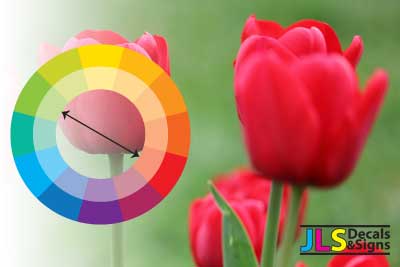
Complementary Colours
Colours directly opposite each other are referred to as complementary colours: red and green, orange and blue, yellow and violet. In each of these, there is one primary colour and one secondary colour. Why is that?
It isn’t possible to mix pigments to create red, yellow and blue. That’s why they’re called primary colours. They cannot be formed by combinations of other colours; all other colours are derived from these three hues. Thus, when looking at two complementary colours, determine which primary is missing from the secondary colour.
In other words, if yellow and blue combine to form green, the missing primary colour—and therefore the complement—is red. If red and yellow combine to form orange, the missing primary colour—and the complement—is blue.
A similar principle applies when determining the complements of tertiary colours, as in the red-orange and blue-green here and in the Miami Dolphins’ branding. (Remember: when naming tertiary colours, the name of the primary colour always appears first: red-orange, red-violet, yellow-orange, yellow-green, blue-green, blue-violet.)


As you can see, the high contrast between complementary colours creates a vibrant look.
Complementary colour schemes must be managed well; otherwise, they appear jarring. It’s best to use one of the complementary colours as the main colour in your design and the other as an accent colour. Alternatively, you could use tints and shades: a lighter tint of yellow contrasted against a darker violet, for example.
Tricky to use in large doses, complementary colour schemes can be effective when you want something to stand out. If possible, avoid using complementary colour schemes for text.
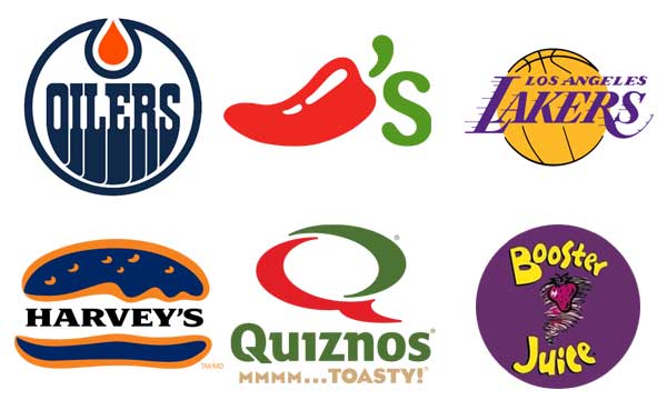
These familiar logos each employ a complementary colour scheme.
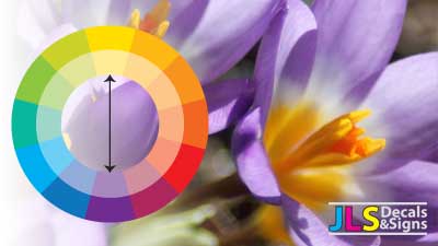
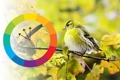
Analogous Colours
Analogous
colour schemes consist of colours adjacent to each other on the colour wheel.
Regardless which two or three colours you combine, they all share an undertone of the same colour. Often found in nature, analogous colour schemes are harmonious and pleasing to the eye. Just be sure to have enough contrast: use one colour to dominate and a second to support. If you choose to use a third analogous colour, use it as an accent.
Combine an analogous group of colours with their respective tints and shades, and you have a lot to work with!
These familiar logos each employ an analogous colour scheme.

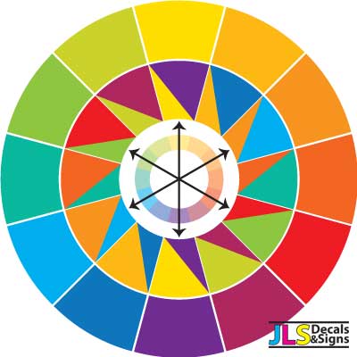
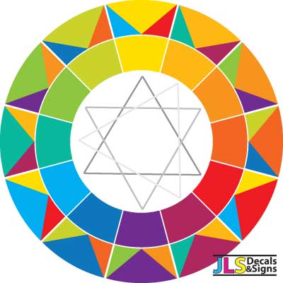
Triadic Colour Schemes
A triad
refers to three colours equidistant from each other. The primary triad (i.e., red, yellow and blue) is a popular choice for children’s products. The secondary triad (i.e., orange, green and violet) is an equally pleasing combination.


The Burger King and Fanta logos employ a primary triad and a secondary triad, respectively.

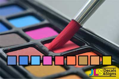
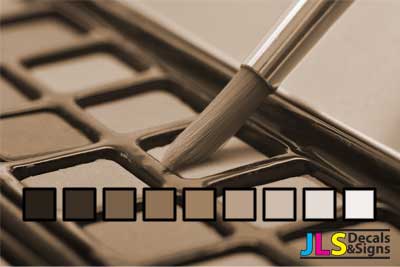
Monochromatic Colour Schemes
Finally, there are monochromatic
colour schemes, based on a single (mono) colour (the Greek chroma means “colour”) and its various tints and shades. You’re already intimately familiar with monochromatic colour schemes if you’re a fan of black and white, or even of sepia, photography. In a sepia tone photo, sepia (a variation on brown) is the pure hue; the taupe, beige, cocoa and chocolate are tints and shades
of sepia

Window tinting for vehicles offers several benefits, both practical and aesthetic. Read our blog for more information

Take the next step to grow your business
This year of 2020 is proving to be a year of an unknown type. Protecting our health and those of the ones we love is a great responsibility so social distancing is worth it. There is also the snow. When will it end here in Edmonton area? At a time of social distancing for healthy and safety, what can we do when a weekend like Easter is near? Well, it might be time to get creative and learn more about technology at our fingertips to be sure connection happens regularly. Here are some ideas to get you started if you are a bit rusty like me. Knock Knock jokes Knock Knock jokes are a video opportunity waiting to happen. I recently rediscovered these corny sources of humor while searching the Internet. Inspired, I video recorded myself saying “knock, knock,” and sent to my almost five-year-old great nephew via his Mom’s smartphone. In a little while, he responded with “Who’s there?” in his own video. From there, we traded short videos until hitting the punch line. It was a much-needed connection in the middle of a day for me. My great nephew and his parents, who are working from home and entertaining their two young active boys, appreciated the diversion, too.

Locally owned and operated,
JLS Decals & Signs serves the communities and surrounding areas of Morinville, St. Albert and Edmonton, Alberta.