Follow Us
Subscribe to our
Newsletter

Your Guide to Typefaces
Oct 11, 2018
What’s a typeface, you ask? Well, it’s a little bit different from a font.
A typeface is easily described as the overall category a specific font falls under and is sometimes called a font family. You can identify what typeface category a font belongs to by looking at specific elements the font has, such as little tails at the ends of letters or a script-like structure.
Serif and Sans-serif are the two most common typefaces. These typefaces are used everywhere, from signs to print in novels to posts on social media. Fonts that fall under these two typefaces are generally easier to read and are fairly simple, unlike fonts which fall under the script or decorative typefaces. While there are more than four typefaces, with varying definitions depending on where you are looking, we’ll be addressing four typefaces you’ll see in your everyday life.
Serif
Serif typefaces can be identified by the small lines added onto the end of a stroke in the letter. These small lines are technically called “feet” and help create a visual separation between letters. These types of fonts are commonly used as body text in printed material, but it’s debated whether or not they’re easier to read.
Within the serif typeface category, there are several subcategories in which serif fonts can be sorted. These subcategories are old style, transitional, Didone, and slab serif. The old style serif typeface dates back to around the time of Johannes Gutenberg’s printing press, while the other three subcategories appeared in the 1800s.
Times New Roman, Rockwell, and Garamond are all examples of the serif typeface.
Sans-Serif
Sans-serif typefaces look incredibly similar to serif typefaces, except they don’t have feet. While serif fonts are distinguishable because of the little lines on the ends of the letters, sans-serif fonts are distinguishable by looking rather plain. They consist of only straight lines, take up less space than other typefaces and are used mostly as a way of conveying simplicity or minimalism.
Within the sans-serif category, there are several subcategories which sans-serif fonts can be sorted into. These subcategories include neo-grotesque, grotesque, geometric, and humanist. Prior to the 1950s, neo-grotesque fonts were sorted under a more general grotesque subcategory. However, neo-grotesque fonts are more versatile and can be used as body text, which sans-serif fonts are not normally used for.
Franklin Gothic, Helvetica, and Trebuchet are all examples of the sans-serif typeface.
Script
Script typefaces may be the easiest to sort into a typeface category as they are inspired by the fluid strokes of handwriting. Unlike serif and sans-serif fonts, script fonts are normally used to create beautiful logos and larger displays. Script fonts tend to add a touch of elegance to designs and can imitate a more personal touch.
Elegy, Mistral, and Brush Script are all examples of the script typeface.
Decorative
Decorative typefaces are sometimes called “display typefaces” as they don’t quite fit into the other three categories (though may have similarities) but are extremely popular when making a sign or headline. Decorative typefaces create a statement and are designed to capture a person’s attention. This category of typeface has a broad scope, with fonts ranging from graffiti-like to inspired by various cultures. Some decorative fonts have even been designed around different the different holidays.
Andreas, Broadway, and Gabriola are all examples of the decorative typeface.
While these may be the typefaces we’ve mentioned, they are certainly not the only ones. Depending on who you talk to, everyone will have a different example of what a typeface is. For instance, certain typeface categories are centred around different languages, therefore those are not typefaces you would see on a regular basis. However, some of those typeface categories are similar in design to the typefaces we commonly see. If you find yourself curious about those typefaces, feel free to take a peek at the Ming typeface!

Window tinting for vehicles offers several benefits, both practical and aesthetic. Read our blog for more information
Take the next step to grow your business
This year of 2020 is proving to be a year of an unknown type. Protecting our health and those of the ones we love is a great responsibility so social distancing is worth it. There is also the snow. When will it end here in Edmonton area? At a time of social distancing for healthy and safety, what can we do when a weekend like Easter is near? Well, it might be time to get creative and learn more about technology at our fingertips to be sure connection happens regularly. Here are some ideas to get you started if you are a bit rusty like me. Knock Knock jokes Knock Knock jokes are a video opportunity waiting to happen. I recently rediscovered these corny sources of humor while searching the Internet. Inspired, I video recorded myself saying “knock, knock,” and sent to my almost five-year-old great nephew via his Mom’s smartphone. In a little while, he responded with “Who’s there?” in his own video. From there, we traded short videos until hitting the punch line. It was a much-needed connection in the middle of a day for me. My great nephew and his parents, who are working from home and entertaining their two young active boys, appreciated the diversion, too.

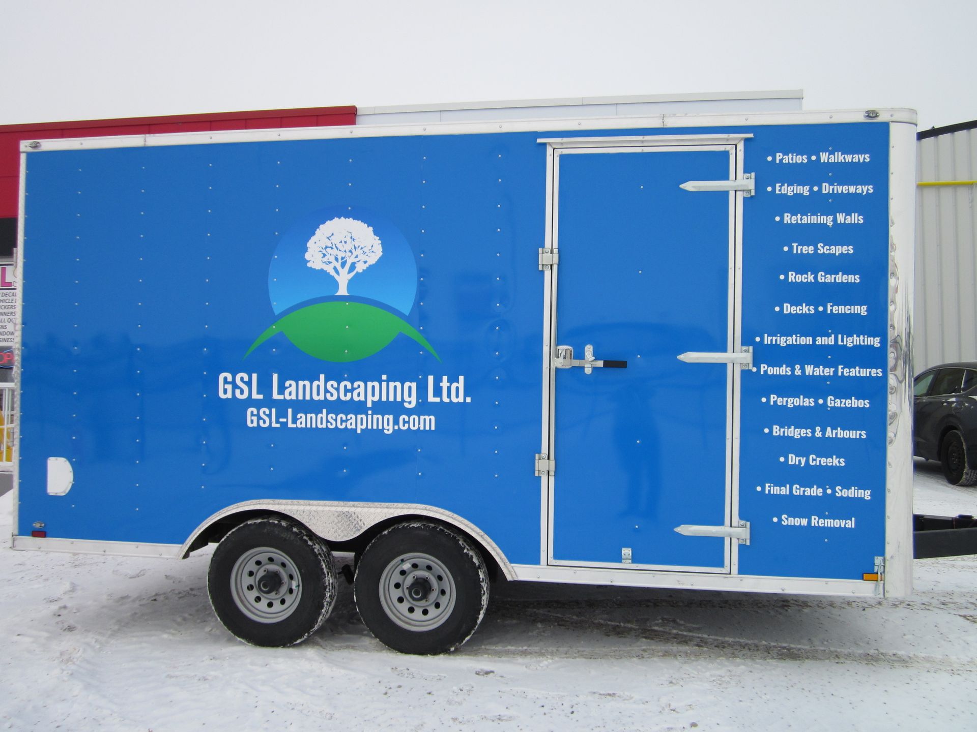
Locally owned and operated,
JLS Decals & Signs serves the communities and surrounding areas of Morinville, St. Albert and Edmonton, Alberta.