Follow Us
Subscribe to our
Newsletter

Our Blog

Window tinting for vehicles offers several benefits, both practical and aesthetic. Read our blog for more information
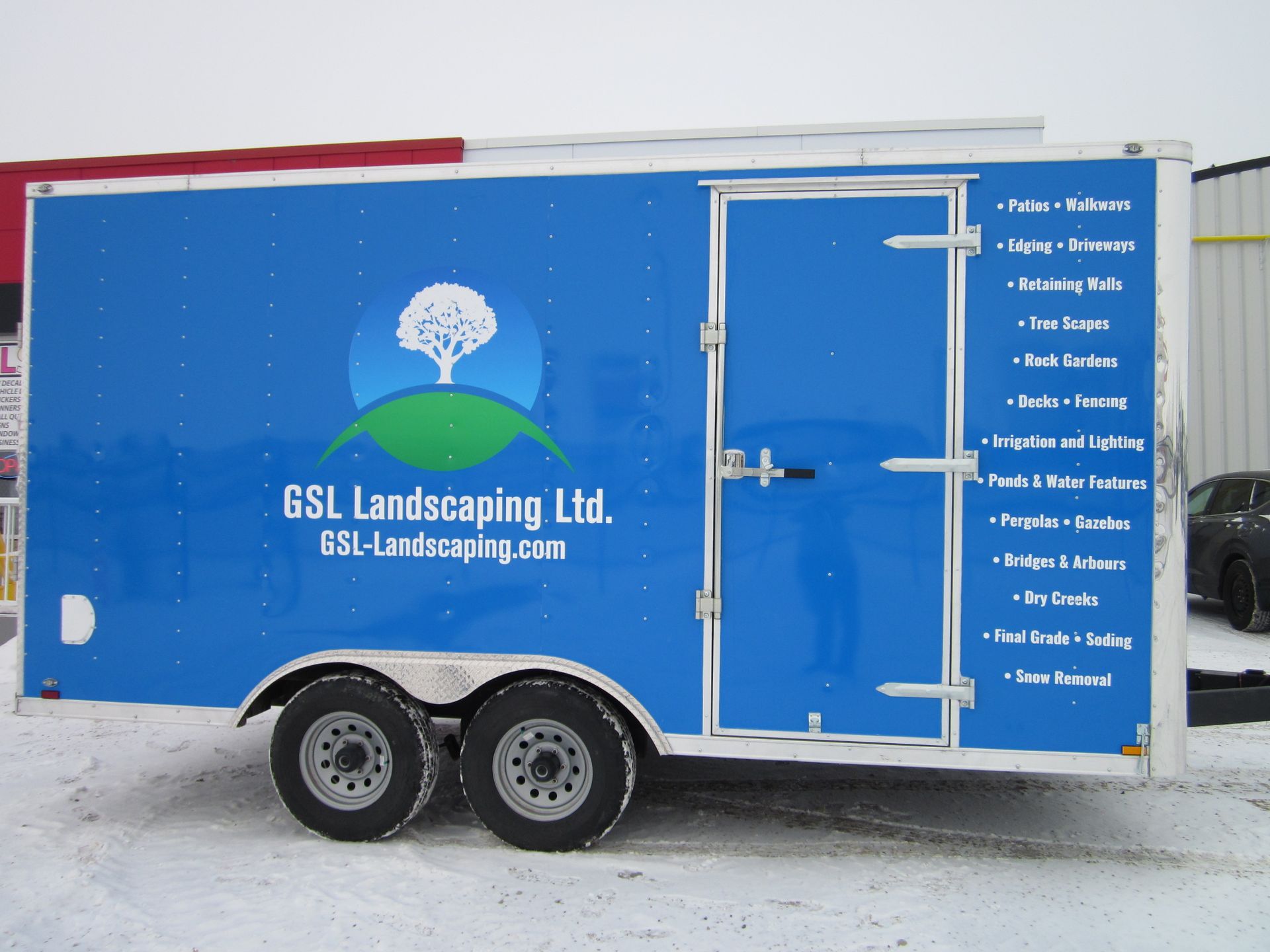
Take the next step to grow your business
This year of 2020 is proving to be a year of an unknown type. Protecting our health and those of the ones we love is a great responsibility so social distancing is worth it. There is also the snow. When will it end here in Edmonton area? At a time of social distancing for healthy and safety, what can we do when a weekend like Easter is near? Well, it might be time to get creative and learn more about technology at our fingertips to be sure connection happens regularly. Here are some ideas to get you started if you are a bit rusty like me. Knock Knock jokes Knock Knock jokes are a video opportunity waiting to happen. I recently rediscovered these corny sources of humor while searching the Internet. Inspired, I video recorded myself saying “knock, knock,” and sent to my almost five-year-old great nephew via his Mom’s smartphone. In a little while, he responded with “Who’s there?” in his own video. From there, we traded short videos until hitting the punch line. It was a much-needed connection in the middle of a day for me. My great nephew and his parents, who are working from home and entertaining their two young active boys, appreciated the diversion, too.
If you’re going to print a photo or digital design, chances are you’ll want it to be in the highest resolution possible. Unfortunately, figuring out the correct resolution and graphic size can be complicated. There are several units which are used to measure resolution including PPI, DPI, LPI, and SPI. However, to keep it simple, we’ll only focus on the two units which are frequently used: DPI and PPI. What is DPI and PPI? Contrary to popular belief, DPI and PPI are not the same thing and cannot be used interchangeably. While DPI and PPI describe the resolution of an image, each term refers to something completely different. Dots per inch (DPI) is used to describe the number of dots per inch in a digital print. DPI determines how many dots the printer drops onto every square inch of the image. This sets the print resolution of the image. On the other hand, PPI refers to pixels per inch. Many designers rely on PPI as it involves the smallest unit of a digital display device which we are able to see. Pixels are used to create the overall image on your computer or television. The confusion between DPI and PPI lies in the fact that the pixels in PPI are made up of red, green, and blue light elements which roughly correspond to the CMYK dots on a printer. Therefore, people assume that DPI and PPI are the same. Simply put, PPI is the input resolution while DPI is essentially the output resolution. How does DPI and PPI affect your prints? As previously mentioned, PPI is only meant to affect what is on your digital display. For instance, you can use PPI to determine the resolution of an image file. If an image is 350×350 in a 1-inch square, then you can assume the image will have a resolution of 350 pixels per inch. Many digital display formats are set at 72 ppi, which determines how big the image will appear on the screen. By increasing the image by 150%, the pixels will become larger and display a blurrier image. Using PPI to print your image may result in it looking incredibly pixelated or smaller than you want it to be. DPI is the resolution of the printed image and determines how high of quality your print will be. While most printers are capable of printing at 300 dpi, professional printers can produce higher quality prints. When the DPI is increased, it will create a smoother transition between colours, removing the blocky look that a lower DPI will produce. Printing an image that is high quality is a balancing act, requiring you to determine whether the size or the quality is more important. However, if it is an image that is meant to be viewed from further away, you might find that a lower resolution will work best. Some billboard posters are printed as low as 20 dpi! We know, it’s a lot to wrap your head around, and that’s fine! Resolution is already a complicated concept, and only becomes more difficult to understand when different units are added. However, it becomes a little easier when you keep the differences between DPI and PPI in mind.
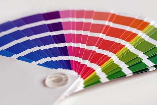
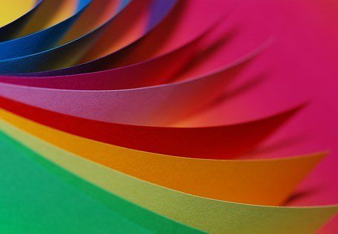
By now, you’ve probably realized how important colour is within design. Many companies and businesses build their brand around certain colours, with some going as far to trademark it such as Tiffany & Co. Creating a strong colour palette is crucial for any business. Using a consistent colour palette will influence people to associate those specific colours with your business. If you’re not sure where to start in creating a colour palette, we’re prepared to guide you through it. Keep Colour Theory in Mind Prior to picking colours for your palette, you need to understand basic colour theory and the relationships between colours. If you don’t understand either, then attempting to create the perfect colour palette will be quite difficult. As we’ve previously discussed, colour can affect a person’s emotions, subconsciously or not. Colour palettes consisting of shades of blue will create a sense of tranquility, while shades of red may grab a person’s attention. You’ll have to consider how you want people to feel about your brand. Creating a Colour Palette Creating a colour palette from scratch doesn’t have to be complicated and intimidating. There are little tricks that can make the process a little easier, and we’re happy to share them with you. If you read our post on colour harmony , you’ll know there are several basic colour schemes you can use: complementary, analogous, triadic, and monochromatic. However, while these traditional schemes make creating a palette easy, they’re not exactly original. For an original colour palette, you’ll have to get a little creative. Trends: Take a look at current design trends to get inspiration for your colour palette. Lately, there’s been a resurgence in using bright and bold colours to balance the minimalism look. Using bold colours on simple backgrounds will guide the viewer’s attention to what’s important and make your design more memorable. Build from images: Photographs are full of colour. By using an image that you feel represents your business or brand, you’ll be able to pull sample colours from it to help create a new palette. There are several ways you can pull colour from images, such as using Photoshop or Canva’s Color Palette Generator . From one image, you can build several colour palettes. Play with shades, tones, and tints : If you have a colour that you feel fits your brand perfectly, feel free to use it. You can create a colour palette using only one colour by playing with varying shades of that colour. Include more neutral colours as well, such as greys. These can create a balance between your original colour and its varying shades.
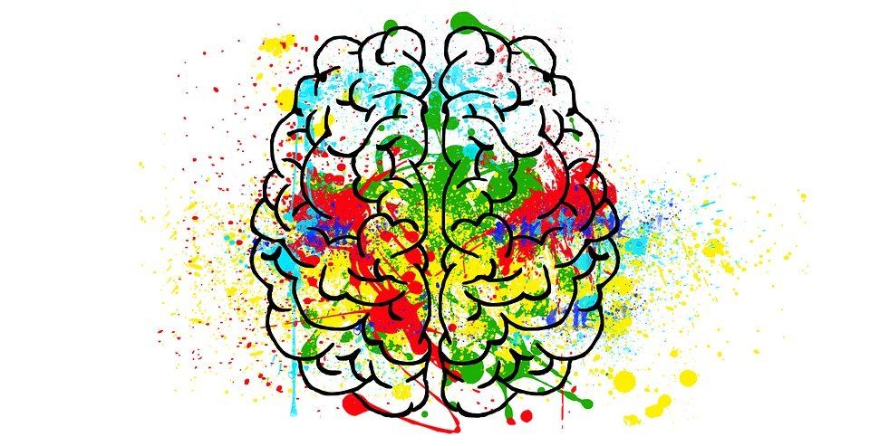
Have you ever felt calmed by the serene blue of the ocean? Or dreary when the city is immersed in a grey fog? Has the yellow of the sun brightened your day? Or have you felt overwhelmed in the darkness of the night? Colour is known to have an impact on the way people feel. It is a powerful tool in persuasion and changing a person’s perception. We have become accustomed to associating certain colours to specific meanings, which are often universal. Today, we’ll take a look at what emotions and feelings different colours invoke in a person! Red Red is vibrant and many associate the colour with passion. Depending on the shade of red, it can create a sense of urgency and grab attention, which is why it’s used on traffic signs. It is also a colour used to convey love. However, since red is such a powerful colour, how people react to it will certainly depend on past experiences with the colour. Yellow Yellow is a bright colour, often associated with cheerfulness and warmth. When people think about the colour yellow, they think about the sun. The colour is capable of persuading a person to be optimistic, but too much can be tiring. Too much yellow tends to cause feelings of stress and tiredness due to the high amount of light that’s reflected. Blue For many, blue is a calming colour. It is the colour of the sky during the day and often viewed as the colour of the ocean. It is a colour people associate with nature and tranquility. However, since blue is a cool colour, it can also represent the cold. This feeling of coldness will depend on the shade of blue used, much like the colour’s association with sadness. Despite the loneliness one may feel when looking at the colour, it is still the colour most preferred by men and women. Green Like the colour blue, green is also frequently associated with nature and the world. It is the colour of the lush forests on Earth, as well as the colour of grass that surrounds us in the summer. Since it’s so closely linked to nature, people see green as another calming colour. However, green is also associated with negative feelings, such as greed or jealousy. Some nutrition-related businesses use the colour green to promote their product, as green represents healing. Purple Purple represents royalty and has been closely linked to it for a long time. As dyes were hard to create, it was difficult to obtain fabric of certain colours. Those who could afford purple fabric were members of the upper class, and thus the colour became associated with wealth and royalty. It is also a colour linked to mystery and unknown, due to its rarity as a colour. White Depending on the culture, white can have different meanings. For Western cultures, white is associated with weddings and hospitals. It is considered to be a clean and innocent colour, but in Eastern cultures, it is closely linked to completely different emotions. In Eastern cultures, white represents death. It is often used for funerals, evoking feelings of despair and sadness. However, white is an extremely popular colour to use for marketing tactics as it implies simplicity and freshness. Black Black represents darkness, the complete absence of light. It has become closely linked to evil and often creates an unforgiving feeling. In many cultures, black is associated with death and mourning. During funerals, people often wear black clothes as a representation of their grief and sadness. Despite black being closely associated with negative feelings, it has also become a popular colour to use to show sophistication and formality. Many businesses use black to create a unified style to their brand, as it is complementary to all other colours. Of course, there are many other colours that evoke certain emotions and feelings. Orange is often associated with autumn and warmth, while pink is closely linked to love, romance, and softness. The next time you’re designing a sign or decal, keep in mind the feeling you want your audience to experience! Once you find the colour that is closely linked to that feeling, you might find that people respond differently to your product. For more information on what colours are the most persuasive, contact JLS Decals & Signs. We’ll be happy to help you.
If you haven’t noticed yet, we love colour. Colour is vibrant and eye-catching and has the ability to change the meaning of the message, emphasize an image, or inspire certain emotions. It’s a valuable tool to use when marketing to the public. Ho ...

As 2018 draws to a close, businesses will be busy preparing a new line of products and services for 2019. Along with new products and services comes new trends on how to market towards an audience. Marketers are constantly reviewing how to effectively reach consumers and that includes figuring out what kind of signage to use. At JLS Decals & Signs, we want you to stay ahead of the curve when it comes to the signage you’re using. We’ve done the research and here’s four trends we expect to see in the new year! A move towards digital Every year, another technology company designs a device that is meant to make our lives easier. As a society, we’ve become reliant on the technology that we use: from cell phones to the Roland VersaCAMM®, JLS Decals & Signs uses to print the signs. Not only does technology influence how we view the world, but it influences how people view products and services. Digital signage has become a popular form of marketing. As society is constantly changing, businesses want to keep up with the consumers and digital signage easily allows regular updates. In addition, interactive experiences have become a key part of the shopping experience and having signage that provides consumers with the opportunity to browse products is extremely important. Going smaller with decals Not all marketing has to be elaborate. We’ve discussed how specific directional signage can help make events such as Boxing Day easier to navigate, and smaller decals are also beneficial for a business. Small decals, such as showing where to place particular products or even simple directional arrows like you see on the floors in Ikea, can give your brand a distinctive look. It can also give your brand individuality, and your employees can have fun coming up with ideas for these decals. Of course, these small decals can help eliminate any confusion that consumers may have, making it more likely they’ll return in the future. Just don’t go overboard when adding decals to your business, as you don’t want to overwhelm anyone. Minimizing the chaos Minimalism can be defined as “living with less.” For minimalists, owning an immense amount of material possessions isn’t ideal and they strive to eliminate anything they don’t necessarily need or find important. While not many businesses have gone this route, we expect minimalist marketing to gain traction over the next few years. The amount of “sale” signage around the holidays and certain events such as Boxing Day and Black Friday can stress consumers out. They might feel pressured to purchase a product or may simply ignore the sales. Unfortunately, this doesn’t help businesses sell their products or service, so it might be the time to downplay the “in-your-face” technique and use something subtler. Make it simpler, straightforward, and easy to remember. Making it personal Personal signage is continuously growing. Since consumers have access to such a variety of businesses, you need something that will draw them to you. What people want is more personalization. For the most part, generic branding and marketing can work. It has for years, after all, but it’s nearly 2019 and people want change. Especially those who feel as though they are underrepresented. More diversity is required if you want to target a new demographic and using signs that display that demographic in particular will certainly catch their eye. The world is constantly changing, and with it, the demands of consumers. Businesses, regardless of size, have to constantly change the way the products are marketed if they want to stay relevant. This requires studying past signage trends and analyzing the target audience to see what influences them to purchase a product or service. What trends are you hoping to see in 2019?

As if December wasn’t busy enough with Christmas, Boxing Day is just around the corner. We’ve seen Boxing Day get overlooked in favour of spending time with family and friends, which we think is wonderful. Yet, there are still people all over the world who aren’t scared to face the crowds. Each year, businesses have to find a way to appeal to customers on Boxing Day. With companies such as Best Buy and The Bay competing for sales, not to mention online websites like Amazon, you need to have something special that will convince people to shop at your store. Unsurprisingly, our suggestion is to have good signs. Having the proper signage for your business is important, but on a day like Boxing Day, it’s crucial. To ensure your day is as successful as possible, follow these three tips! Direct them where they want to go Navigation is an integral part of life and no one wants it to be difficult. This is extremely important on busy days like Boxing Day, as customers are in a hurry to find what they want. Place signs over key areas in your store, whether it be directly above or along the back walls. It is also beneficial to use signs at the entrance of the store to eliminate any confusion that may occur. These signs can also help keep traffic in the store moving in a calm manner, which ensures your customers’ safety. Get to the point Sometimes beating around the bush can work in your favour. However, when it comes to signage on Boxing Day, doing so will only harm your business. Numerous studies have been done to show that people don’t take the time to read the fine print. It’s a hassle and people don’t want to waste valuable time trying to read tiny font. You can make it a little easier for consumers by not putting any fine print on your sales signs. Retailers are notoriously bad for excluding certain products during sales, but never put it in a bigger font for everyone to read. This often irritates consumers when they go to pay, so don’t be that person. Use signs to state your sales plainly, without including any exclusions. Be creative The same marketing strategy can become quite boring, especially to customers who frequent your store. Since Boxing Day is (technically) only one day, your marketing strategy doesn’t have to be too complicated, but it should be creative. Instead of using a generic red “Sale!” sign, consult with a designer to create a sign that will stand out from the crowd. If you want to reach your target audience, analyze what they’re looking for and focus your signs around their needs. By creating eye-catching signs, consumers are far more likely to show interest in your products! Boxing Day can be stressful for both consumers and business owners, but you can make it easier on everyone by following these three tips. Keep your sale signs simple and creative, don’t let the marketing strategies of other companies influence you! If you’re interested in what type of signs you can use to promote your business, feel free to contact us. We’ll be happy to answer any questions you have.

It’s that time of year. The snow has fallen, and people are flocking to the shopping malls to complete their Christmas shopping. Finding the perfect gift for your loved ones can be difficult, and the amount of options can be overwhelming. As a business that dabbles in creativity, we want to make finding a gift for the creative in your life a little easier. Whether they’re a graphic designer, an artist, or a writer, we’re sure that something on our list will cater to their interests! Enamel Pins For something a little simpler, consider getting the creative in your life a pin representing their career or hobby. Depending on the type, the pins can be inexpensive and the perfect stocking stuffer. There are numerous places around the Internet (like Etsy or Super Team Deluxe ) where you can find a pin that you think your loved one will appreciate. MVMT Watch MVMT began in 2013 in response to the overpriced and outdated looks in the fashion industry. By utilizing social media, Jake Kassan and Kramer Laplante grew their small business into a community made up of over 1.5 million people. MVMT creates beautiful minimalist products at affordable prices, which can help the creative in your life keep track of time. Pantone – Color: Messages & Meanings Who would we be if we didn’t mention Pantone? A few weeks ago, we discussed what Pantone is and the importance of the Colour of the Year . However, Pantone does more than just organize colours, the company also has a line of products you can buy! Our favourite product from Patone is Color: Messages & Meanings. Color: Messages & Meanings is filled with essential guidelines and illustrations that can help creatives find the perfect colour combination. Choosing the right colour is extremely important and this book is certainly a valuable resource. Lap Desk This may be our top suggestion for anyone in need of a gift, not just creatives! Have you ever noticed that the bottom of your laptop heats up while it’s resting on your lap? That’s because the fan installed in your laptop isn’t able to get the excess heat out. This is why we recommend getting a lap desk. Lap desks are extremely handy when flat, hard surfaces are unavailable. Some lap desks are designed to keep laptops elevated, allowing air to reach the bottom of the laptop, while others provide a flat, hard surface to work on. You can find a lap desk at Best Buy and Staples! Wacom Tablet Since its inception in 1983, Wacom has become known as the #1 drawing tablet for artists and designers. If you’re willing to spend the money, then we recommend looking into the Cintiq. The Cintiq is wonderful for those who have made a professional career out of digital art and would rather look at the tablet while working then at the computer screen. This tablet also comes highly recommended for those who do a lot of line art. The Intuos series comes in different sizes for your convenience and is more affordable than the Cintiq. Those who use the Intuos normally use them for simpler tasks but are capable of handling digital art as well. Unlike the Cintiq, the Intuos is easy to use with keyboard shortcuts and can fit into a backpack. Modern Calligraphy Set Calligraphy has been around for centuries and is certainly pleasing to the eye. No matter the language, calligraphy has the ability to make any letter or character look beautiful and has inspired many different fonts. Luckily, the art of calligraphy hasn’t disappeared. Give the creative in your life the chance to create a flowing script with their own calligraphy set . Just make sure you stock up on extra ink for the pens! Chalkboard Mug While we think most of our suggestions are pretty neat, owning a chalkboard mug would certainly be something different. Sometimes ideas come at the most inopportune times but having a mug nearby that can be written on would be incredibly helpful. A New Museum exclusive, the chalkboard mug is fully erasable and microwave-safe, so your coffee or tea can be reheated at any time. Best of all, coloured chalk is included, so the mug can be as colourful as you want it to be! That concludes our gift guide for this holiday season! Comment on what your favourite gift on this guide was or feel free to reach out to JLS Decals & Signs on social media. We’d also love to hear what other products you think would make a wonderful present for the creative in your life.

Locally owned and operated,
JLS Decals & Signs serves the communities and surrounding areas of Morinville, St. Albert and Edmonton, Alberta.