Follow Us
Subscribe to our
Newsletter

What is CMYK, RGB, and PMS?
Jan 02, 2019
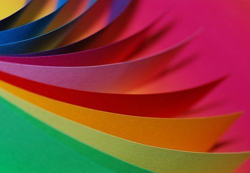
PMS Colour
In a previous post, we’ve discussed the Pantone Matching System. It is a system created by Pantone that sorts created inks into distinct shades. The system is utilized by graphic designers and printing houses, as it provides a reference for exact shades in colour. Printers often have slight differences in calibration, making it difficult to get a perfect match, but PMS helps prevent this issue. Businesses and brands which have specific colours associated with them will use PMS to maintain consistency. If you’re interested in using a specific colour for your brand, browse Pantone’s Colour Finder
and find the specific number code for that colour!
CMYK Colour
Unlike the Pantone Matching System, CMYK relies on a four-colour process: cyan, magenta, yellow, and key (black). The CMYK process works by using ink that absorbs the light reflected from the white of the paper. The model is considered subtractive as the inks essentially subtract red, green, and blue from the white light. This leaves behind the CMYK colours: cyan, magenta, and yellow. Combining the inks will leave you with black. CMYK colours are mixed during the printing process, as opposed to being chosen prior. Because of this, there may be inconsistencies in the colour when more than one copy is printed.
RGB Colour
RGB simply means Red, green, and blue. The RGB model is only used for digital works, as screens emit light. While the CMYK model depends on inks during the printing process, the colours in the RGB model are created by blending light. Combining all the colours would result in white being created.
If you’ve ever printed an image and the colours seemed different than what was on the screen, it’s because of these colour models. When something is printed from the computer, which is using RGB colour, it’s converted into the CMYK model. This is why RGB colours will appear more vibrant than CMYK colours, as the RGB model uses light instead of ink.
Next time you’re working with colours, keep these models in mind! If you’re still confused on how these models work, stop by JLS Decals & Signs and we’ll be happy to help you.

Window tinting for vehicles offers several benefits, both practical and aesthetic. Read our blog for more information
Take the next step to grow your business
This year of 2020 is proving to be a year of an unknown type. Protecting our health and those of the ones we love is a great responsibility so social distancing is worth it. There is also the snow. When will it end here in Edmonton area? At a time of social distancing for healthy and safety, what can we do when a weekend like Easter is near? Well, it might be time to get creative and learn more about technology at our fingertips to be sure connection happens regularly. Here are some ideas to get you started if you are a bit rusty like me. Knock Knock jokes Knock Knock jokes are a video opportunity waiting to happen. I recently rediscovered these corny sources of humor while searching the Internet. Inspired, I video recorded myself saying “knock, knock,” and sent to my almost five-year-old great nephew via his Mom’s smartphone. In a little while, he responded with “Who’s there?” in his own video. From there, we traded short videos until hitting the punch line. It was a much-needed connection in the middle of a day for me. My great nephew and his parents, who are working from home and entertaining their two young active boys, appreciated the diversion, too.

Locally owned and operated,
JLS Decals & Signs serves the communities and surrounding areas of Morinville, St. Albert and Edmonton, Alberta.