Follow Us
Subscribe to our
Newsletter

Repetition
Consistent and Unified Design
There’s value in repeating particular design elements. Consider magazines as an example: what makes multiple pages appear to belong together? Aha! It’s repetition!
One of the four basic design principles , repetition of certain elements (a bold font, thick lines, a particular bullet) makes designs appear consistent.
Let’s explore repetition and they ways it’s used to unify all parts of a design.
Like contrast , repetition draws the eye in and keeps it on the page as long as possible. Repetition achieves two key aims:
- It creates visual interest.
The more visually interesting a design, the more likely audiences will take a closer look. - It makes content organization and visual consistency more obvious.
Repeated elements appear to belong together. By tying everything together, they establish continuity.
Take a look at these business cards. Both have the same basic layout. Both are simple and neat. Both convey the same information. Repetition stems from stronger, bolder type in the second design.
Notice where your eye moves. When you reach the phone number, where does your eye travel? Do you look again at the name, also in bold type? Repetition unifies the design and ties the various pieces of information together.


Re-evaluate design concepts already underway. Can you render projects such as this newsletter more consistent by repeating certain elements? Headlines and titles are a good place to start: do they all employ the same font? Are your subheads all the same size and colour? Are your page numbers in a consistent location on each page?
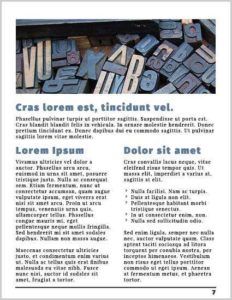
The single, wide column in this newsletter occupies the same space as the two columns beneath it. This maintains the consistency of the page’s outer borders. The list in the right column employs the same bullet. It’s probably safe to assume that this bullet is used elsewhere in the same publication.
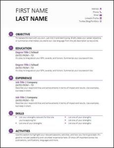
Notice the use of italics, bold type, horizontal lines and the purple bullet in this resumé. Even within a single-page document such as this, repetition helps establish continuity that ties the entire page together.
Consider repetition and consistency when designing multiple pieces, too. For instance, when creating business stationery, leave no doubt that invoices, letterhead, business cards, envelopes and rack cards all represent the same company and a single brand.
Take the repetition that already exists within your projects, then make your designs stronger and more dynamic. Doing this not only makes your concepts more visually interesting and consistent, but it also lets audiences determine more easily how your information is organized.