Follow Us
Subscribe to our
Newsletter

How Big is Big Enough?
Oct 18, 2018
And Two Other Key Typographical Features You Should Know
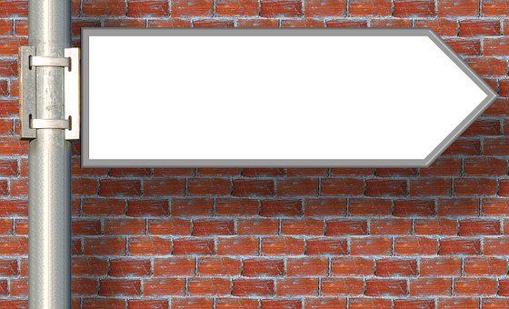
Designing a sign for your personal use or business may seem like a fairly simple task, but you may be surprised at how much thought goes into the process of sign creation. If you were to take a drive in your neighbourhood, the odds of driving past a directional sign is pretty high. These signs have been carefully planned, from the type of font
displayed on it to the colour
that is used, in order to enhance the sign’s legibility. However, the typeface and colour are only a fraction of what is considered when creating the perfect sign.
Less is More
We know it’s fun to play around with different fonts and some are very nice, however, the legibility of a sign decreases whenever another font is added. Having too many types of fonts on one sign can be distracting for the people reading it as it makes the letters seem jumbled. This can lead to the message getting lost and people may ignore your sign completely. The best way to combat this is to decide on two fonts, preferably from the serif and sans-serif typefaces. Pairing a simple serif font with a script font can make the design look elegant, however, combining several types of script fonts with a serif font will ruin that simple beauty. Most fonts come with several variations in weight and style, allowing you to create an immersive, creative sign without resorting to chaos!
Size Matters
When it comes to creating signs, size matters. We’re not talking about the size of the sign or banner, but the size of font. Letter height (also referred to as letter size) is the overall height of your text and it will help determine whether your sign is legible from a distance. The smaller the text, the less likely people will be able to read it. When thinking about the size of your font, it’s important to consider where the sign is going to be placed. If you’re plastering your sign to a billboard, it’s a good idea to keep the letter height large and bold so people can see your message clearly. The general rule when it comes to letter height is for every 10 feet of viewing distance, increase the letter height by 1 inch.
The Art of Kerning
Kerning is not a word most people will be familiar with, but it will ultimately help you create an appealing sign. Kerning refers to the amount of space between two letters (or characters) and the process of adjusting said space to make it appear balanced. If you’ve ever looked at a sign and felt that something was off, but you couldn’t point out what exactly was bothering you, chances are it had to do with the letter spacing. The human eye is quick to pick up irregular breaks between words. Adjusting the distance between each letter, the legibility of the sign will increase. However, the amount of space between each letter will differ depending on how the mind interprets it. Kerning is the perceived amount of space between each letter, rather than the actual amount of space. Perfecting the space between each letter will take understanding, practice, and concentration. If you’re ever curious and want to try kerning out for yourself, Kerntype
is an online program which walks you through how to kern properly by giving you exercises to complete. The more you practice kerning, the easier it will be!
You may have decided designing a sign with perfectly legible typography is incredibly difficult and you’re giving up, but we promise it’s easier than you think! And you can always drop by JLS Decals & Signs and let our team assist you in your quest.

Window tinting for vehicles offers several benefits, both practical and aesthetic. Read our blog for more information
Take the next step to grow your business
This year of 2020 is proving to be a year of an unknown type. Protecting our health and those of the ones we love is a great responsibility so social distancing is worth it. There is also the snow. When will it end here in Edmonton area? At a time of social distancing for healthy and safety, what can we do when a weekend like Easter is near? Well, it might be time to get creative and learn more about technology at our fingertips to be sure connection happens regularly. Here are some ideas to get you started if you are a bit rusty like me. Knock Knock jokes Knock Knock jokes are a video opportunity waiting to happen. I recently rediscovered these corny sources of humor while searching the Internet. Inspired, I video recorded myself saying “knock, knock,” and sent to my almost five-year-old great nephew via his Mom’s smartphone. In a little while, he responded with “Who’s there?” in his own video. From there, we traded short videos until hitting the punch line. It was a much-needed connection in the middle of a day for me. My great nephew and his parents, who are working from home and entertaining their two young active boys, appreciated the diversion, too.

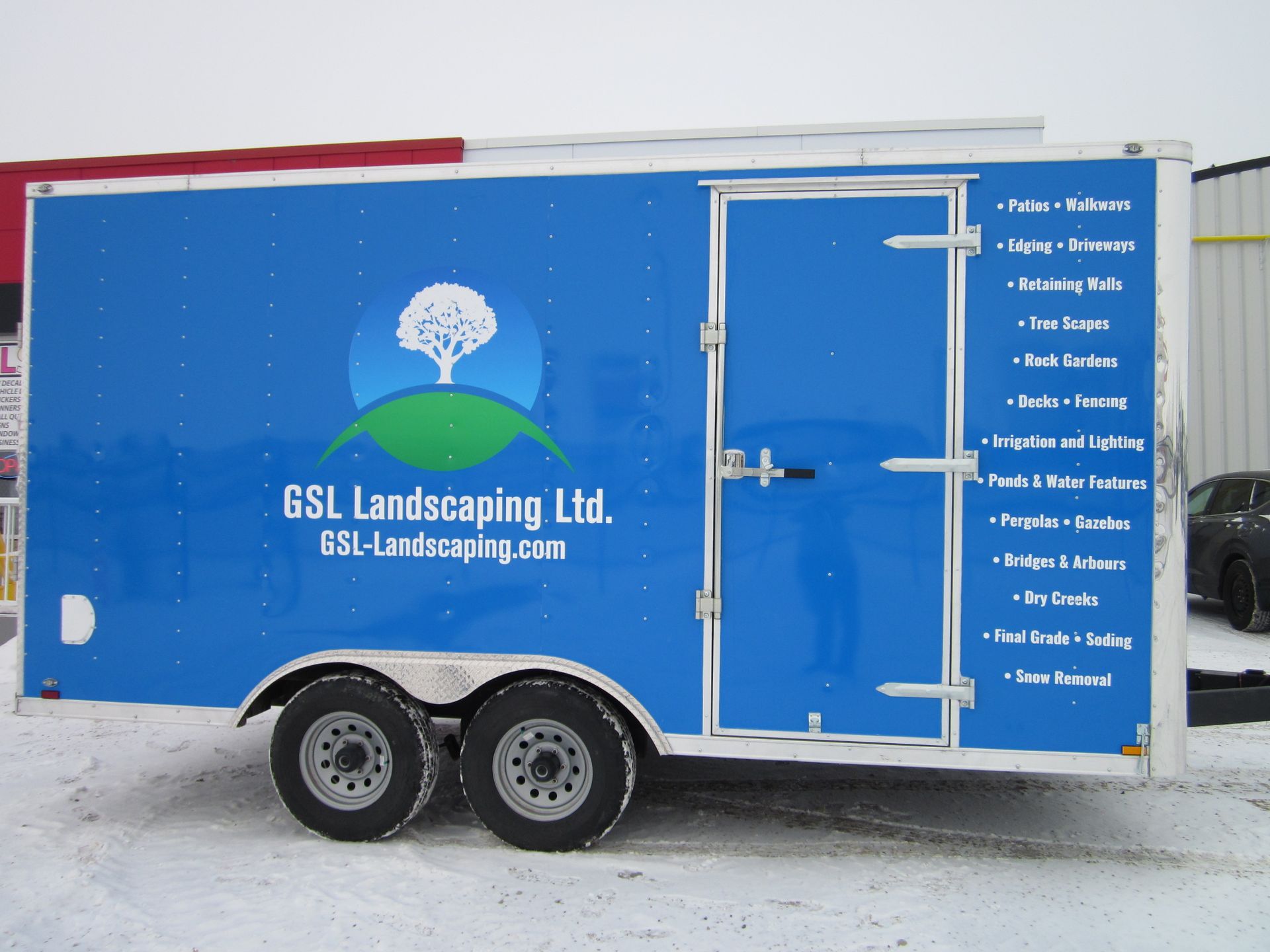
Locally owned and operated,
JLS Decals & Signs serves the communities and surrounding areas of Morinville, St. Albert and Edmonton, Alberta.