Follow Us
Subscribe to our
Newsletter

Alignment: Order from Chaos
Resist the temptation to plop text and graphics into a concept wherever there happens to be room, without considering other elements. After all, you don’t to end up with the Old MacDonald effect: a headline here, a tagline there, E-I-E-I-OMG! Use alignment to bring order to visual chaos.
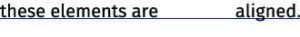
Alignment is a conscious choice resulting in a strong cohesive design. Even when separated from each other, there’s an invisible line or design grid that connects aligned elements.
One of the four basic design principles , alignment connects elements on the page. Strong alignment achieves particular objectives, whether a sophisticated, formal, fun or serious look.
- It results in a strong cohesive design.
Even when elements are not placed close to each other, alignment indicates their relationships by unifying and organizing the design. - It creates a visual tie between separate design elements.
Alignment makes them appear unified, connected and interrelated. Even when not close to each other, placement and alignment let audiences know the elements belong to the same piece.
Business cards illustrate this principle very well.
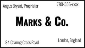
In looking at this example, nothing appears to align with anything else. In fact, there appear to be three alignments: flush left, flush right and centred. The two text elements at the top are not aligned along the same baseline, and they’re not aligned at the left or right edges with the text elements at the bottom. Remember the Old MacDonald effect? Oy!
Which text elements should be grouped? Which should be separated?
Now that you’ve decided, you may choose to align them down the centre.

This centre-aligned text groups text items into logical proximity. The text is centre aligned over itself and centred on the card. Many people centre align everything by default. It’s a safe approach. Although it may seem comfortable, more formal and more sedate, it’s nevertheless weak and dull. The edges are “soft,” and audiences don’t really see the strength of a line on either the left or the right. How might you improve on this?
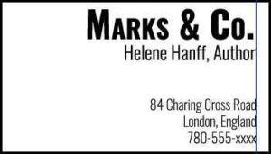
This last example, as with the example in which all text is centred, groups text items into logical proximity. However, now that the contact information is right aligned, it’s far easier to see the “hard” edge on the right. There’s a strong invisible line (shown here in blue) connecting the edges of these two groups of text. Combine a strong flush right or left alignment with good use of proximity, and you’ll soon discover that the strength of your layouts comes from the strength of this line.
Stationery, too, offers opportunities to flex your design muscle. Unfortunately, although free to explore placement and alignment, too many designers revert to flat, centred alignment. The result, although it does the job, can be pretty boring. In this first example, the centred layout is nothing out of the ordinary, even rather dull. The border confines the space meant for text. No amount of brilliant copywriting can break free of these chains!

In this second example, flush left alignment adds a certain sophistication. Limiting the dotted line to the left side of the page emphasizes the alignment.
In this third example, the text, although placed on the left side, is flush right. Any letter written on this letterhead will have a strong flush left to align with this invisible line. Clever!
And, if you feel especially confident in your design abilities, break the rules and be bold!

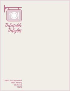
Even in this example, you’ll notice that the name Delectable Delights , the address block at the bottom and the “arm” from which sign hangs all align along the same invisible line! (Bonus points if you also noticed that the right edge of the name and the end of the address block also align with the blade of the knife.)
When placing design elements on the page, ensure that each one is aligned in some way with another element. Never place elements arbitrarily. If lines of text are across from each other, as in the first business card example, align their baselines.
If laying out several separate blocks of text, align them along their left or right edges. If your design includes several graphical elements, align their edges with other edges on the page.
To recap, lack of alignment results in designs that are far from aesthetically pleasing. Alignment provides reassurance, creating a sense of calm and orderliness. Effective design allows audiences to draw lines to aligned objects, even if the overall presentation—at least on the surface—seems to be a disordered collection of objects and text.